Showing posts with label consistent message. Show all posts

Wednesday, October 26, 2011

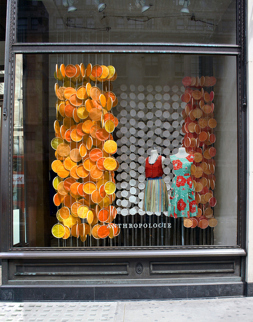
A Wonderful Summer at Anthropologie

It's a dark day here in NYC - so we are looking back to a brighter time a couple months ago.. at Anthropologie - a brief look back to creative uses of used objects.

Anthropolgie's windows vary from store to store, yet always follow a consistent theme and shared elements.
Here's a few interpretations showing wine corks for Earth Day, and hanging paper petals for summer. We love the creativity and craftsmanship and look forward to seeing the holiday windows - sure to dazzle us soon.


Tuesday, September 20, 2011

Ecomm gift card boxes, baubles and tissue

Gift cards are continuing to grow as a way to give a gift will allowing the recipient a little freedom to choose. But brands are finding they need a way to give the gift card while tying it back to the brand and giving a better presentation.
Viola the gift card box! This gives the card a safe and secure presentation that can be hot stamped with the brand logo and allows room for tissue or embellishments if desired.
Here we see a branded, interleaf tissue, a custom bauble tie on and a token gift. We gave these out at a trade show but would be happy to

help you custom create your own.
give us a call!

Saturday, August 20, 2011

The CDW Fan Club Grows

This is baby Katherine, our newest CDW fan, all the way from Guatemala! She looks so cute here in her CDW Merchants branded onsie and we sure appreciate her support.
Send us a picture of your latest creation in their CDW threads and we'll include them here. Thanks Katherine for being the newest mini-member of our fan club!

Tuesday, August 9, 2011

Color blocking at Ann Taylor

We've seen it on the runway and all over fashion magazines, so it was only a matter of time till color blocking manifested itself to a window campaign.

Ann Taylor got the trend right by injecting neutrals with brights and staying minimal. This campaign was translated from their
website and incorporated solid color banners, mannequin bases and risers blocked with bright colored clings.

They were able to take a trend right idea and present a simple minimalistic presentation that made a bold statement.


Now I'm ready to start color blocking, how about you?


Tuesday, September 28, 2010

Covering up the details at Restoration Hardware

Visual Merchandising is ALL in the details as seen here at Restoration Hardware. When a store that sells furniture and housewares uses props, they should do so with a clear sense of brand awareness and RH continues to excel in that realm.

It's obvious that a book case "shows" better with books in it, however, covering the books in a monochromatic fabric that is tea stained to appear aged, keeps the focus on the furniture and not the props.

This neutral and yet textural prop used throughout the store to highlight furniture and accessories is a great compliment to the palette of the store and a nice balance to the green of the topiaries.


Thursday, August 5, 2010

Looking Back at J. Morgan Puett

One of the masters in brand appropriate visuals and the store environment -
J. Morgan Puett's Broom Street store in Soho in the early 90s was an oasis of southern charm. With it's red Georgia clay on the floor and walls and ceiling covered in battered tin, one would be transported immediately upon entering to a kinder, gentler world, where 'sitting a spell' on worn rockers was an activity and shopping was secondary to visiting and chatting.

And yet, shop one did, because they wanted to be part of the what was and feel the washed linens and wrinkled clothes upon their skin. There was some nostalgia certainly, but not in a sentimental way and wearing the clothes and being surrounded in the environment of the well curated shop made one feel welcomed and at home. The store told the story and told it well.

Today, Morgan is creating something of a different environment at her artist commune in Pennsylvania - and if you missed Soho, here's your chance to see some of the objects revisited - www.mildredslane.com


Wednesday, November 11, 2009

When aging is "a good thing"...

Sometimes a client needs a look that's old or antique but can't use the real thing.

Eddie Bauer uses vintage looking props to enhance their store environment but needs too many to make collecting feasible.

Distressing new props is a great way for them to get the spec they want, in the quantity they need and at a price they can afford. Plus it helps keep all their stores consistent while still maintaining their brand image.

As the saying goes, 'everything old is new again' (and in this case vice versa!)


Tuesday, September 15, 2009

All tied up in ribbons!


We can't stress enough how great it is to see consistency in a store's presentation! When a brand cares enough to tie there marketing, visual merchandising, product display and advertising all up together, we care enough to notice!

(even saw a marketing photo where the girl had a ribbon bow in her hair and the frame that was displaying the picture had a similar ribbon bow as a prop- now that is consistency!)

And it's nice to see signage hanging from ribbon, rather than clear fishing wire, especially when it ties into the product. Aerie definitely had it's eye on the details and this back to school install is all tied up!

Thursday, July 9, 2009

Brand Consistency is Key!


We have already said that Ralph Lauren is consistent in his brand message, carrying his vision throughout all his stores but it is great to see! While in Milan, we saw this store which looks like it could be Bleeker Street in NY. The plantings, the awnings, the window dressings are all so brand specific and let you know exactly where you are no matter which country you are in.


Look around - where do you see brand inconsistencies and what helps keep a brand 'on message'?


Monday, April 20, 2009

Like a Moth to a flame


Always drawn to beauty, found myself once again in front of Bergdorf Goodman's - looking at the most stunning digital prints of Moths from Joseph Scheer's new book. The complementary fashions exhibited along side this artwork made the windows truly magical. Another fine moment for art and fashion.

Friday, April 17, 2009

10 Things to consider when planning an appealing window

With so much competition, how do you "cut through the clutter" and make your windows stand out? Think of these 10 things when planning your window and you are sure to hit on a winner.

1. Keep an inspiration guide to help you generate ideas. Whether its tear sheets, postcards, photos, books - have a place to log visual references. Always be seeking inspiration.
2. Keep a record of your past windows. Look back on past work by year, month or season–you don’t want to repeat but you do want to know what worked so you can re-use a concept.
3. Speak to your stores marketing team to know what products to highlight – its best if you can plan by the year or at least the quarter. Stores should have a consistent message throughout.
4. Focus window design on what products you are selling. Good VM should tie back to merchandise – find a thread to link props to product.
5. Hold brainstorming sessions with team members from various departments; sales, PR, VM, etc to get different points of view and fresh ideas.
6. Speak to your store or brand audience. Tailor your windows to appeal to your customers. Controversial window designs are maybe not the right choice for stores with an older, traditional clientele.
7. Fully design your window(s) layout and be clear of objective before you begin. Think how it will be viewed and will it convey the message you are aiming for?
8. Set a budget and timeline and determine how you will get all items to store by install date – leave time for accidents, delivery mistakes and problems.
9. Add props and enhancements that will make pedestrians stop and note, or customers take a second look within the store. Be bold – people love to be wowed!
10. After you have installed the windows or store sets, walk around and check work. Stand outside and listen to people talk – they may give you things to think about for next time.

And finally remember to be flexible. Sometimes the best ideas are not carried out with perfection and can muddle the message. You may need to change your idea midstream but don’t get stuck – your goal should always be about the end result – a great window or floor set. And remember, sometimes - less is more (and sometimes it’s not).

Monday, February 23, 2009

Consistency Keeps a brand alive

Recently some marketing people were asking what helps a brand stay relevant and how do you manage all the forms of online and offline communication. The answer that came through loud and clear was - consistency. No one has done a better job of staying "on message" than Ralph Lauren. The lifestyle brand that RL sells is highlighted in his clothes, ads, marketing and windows. Here the college pennants and trophies are old and battered but make a dramatic presentation that sells his message of casual elegance and the collegiate life. Using a collection of props in your window is a great way to explain your brand. What do your windows say?