Showing posts with label Gap. Show all posts

Friday, December 16, 2011

The Gap is Stringing Us Along...

The Gaps windows are bright, colorful and graphic this holiday! With tree silhouettes in lights, tape, and gift cards these layered windows, filled with wrapped boxes tied with bright colored yarn, have a young urban feel about them. We love the tactile quality when you look at yarn up close and the yarn letters. Simple materials in a modern way!


Saturday, December 3, 2011

Black, White & Red All Over


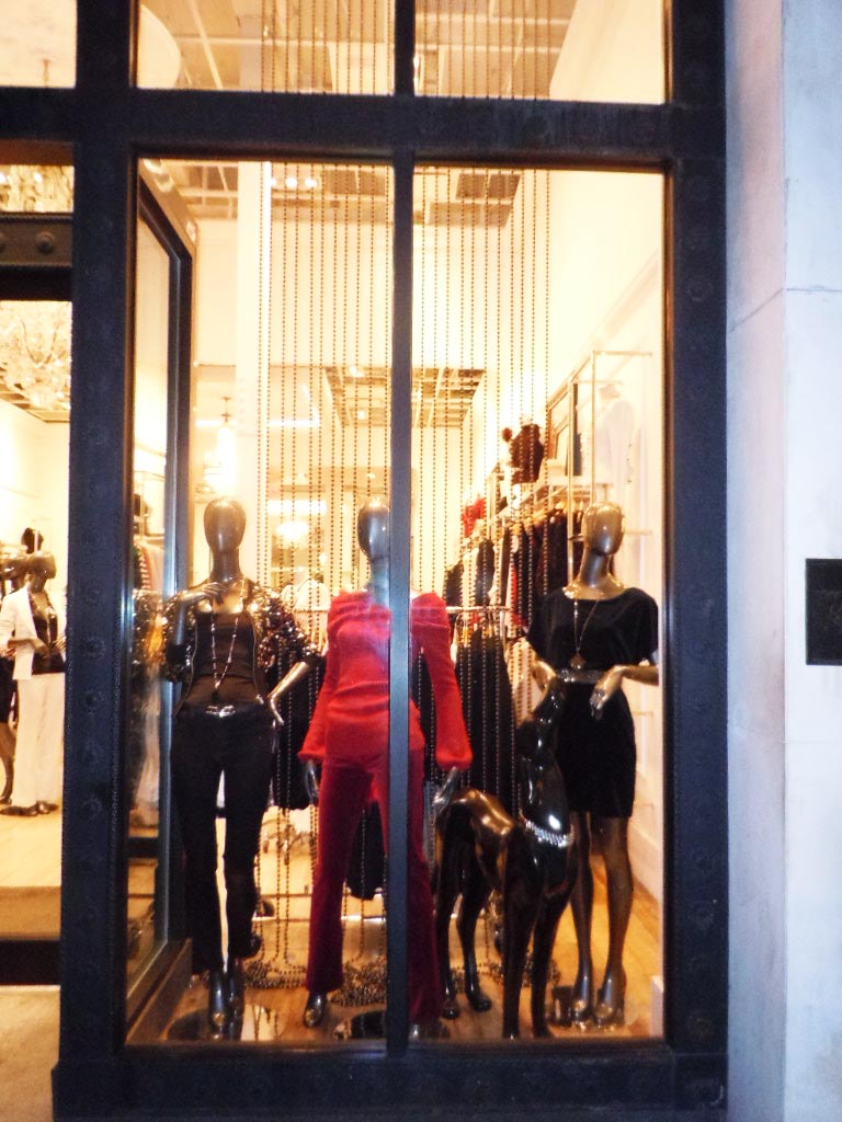
We've seen the black, white and red color story before. Which is exactly why we had to stop and double take these windows at White House/Black Market.

Lovely trunks in the window along with
understated black beaded curtains and a sleek black lacquer panther gave us a reason to stop. Stop by and let us know what you think!

Monday, August 15, 2011

What's behind the curtain at retail?

Most of us think of curtains in the traditional sense with drapes of fabric used to give shade to our windows. In visual merchandising the use of a "curtain" can be widely interpreted and help lend excitement to a store window.
Here are a number of ways stores create a "draped window" - ranging from the traditional curtain to much looser uses of the word. Whether it's to tie in a color or pattern as The Gap has done to highlight it's gingham collection or to add visual interest as seen here with a beaded curtains at Sears Kardashian shop in shop.

Curtains, traditional or in alternative forms, are an effective and simple tool to add dimension to a visual presentation.


Friday, June 10, 2011

Its all about the paper!


The current trend in windows is paper - as lanterns, garlands and flower fans they have been seen around town in a number of store windows.


Free People hung paper vine garlands for a jungle like effect which adding a nice pop of color to their 5th Ave location.


Kate Spade, which we covered last week was filled with colorful paper lanterns in pinks, oranges and yellows along side the Indonesian inspired umbrellas.


Gap Kids filled their windows with paper fans and flowers in different shades of blue which was simple yet impactful.


And at Lucky Brand the trend continued with white lanterns against their 'Summer of Love' denim theme.


All of these windows with their paper props signal summer. Keep an eye out for where it will show up next.


Monday, October 25, 2010

Banners and Ribbons at Gap and Express


We always enjoy seeing similar ideas at different places and here's a new example.
At Gap, they have made a ribbon "curtain" using 2" thick gros grain and lucite stripes to keep it taut, while adding additional ribbon to mannequins perhaps in reference to the upcoming holiday season.
While at Express, they are using a combination of shiny and matte papers in 12" strips to create a little splash for their new perfume.
Both are simple ideas but cleanly executed and add a welcome burst of color to help catch one's eye.
Note the Pink Ribbon entry below from last week which uses a similar idea and I'll add another version in paper soon.


Thursday, September 16, 2010

2D become 3D at Gap


Here is a cute way to help marketing send an impactful message (insert black and white and red all over joke here)
Great cardboard cut outs - balloons, poodle and eiffle tower - really say Paris!
And this says children's whimsy which as you know...we love.

Wednesday, August 12, 2009

Back to school!


I don't think I will ever get use to seeing signs of "back to school" beginning in July. Just as the summer is heating up, the cool looks of fall appear for the junior set.
"Leading the pack" this year was Gap, with it's locker sets in primary colors that at least add a cheery back ground to the serious business of shopping for school clothes. Because as much as we all like new clothes, we know the inevitable is coming - bye bye beach, hello classroom.
Now if only I could remember my locker combo!

Monday, July 20, 2009

Let's poll the pole....

Do you love it or hate it?
We see this one often - a wooden pole used to promote one item; in this case shorts and polo shirts. Visual merchandisers seem to like this simple idea - hanging a pole with multiple examples of the same item - maybe to highlight available color or different fabrics. It does give the viewer the visual range of options available at a glance. But is it innovative or interesting? What do you think?

Monday, June 1, 2009

Stripes Are Us


intersecting lines, diagonal stripes and plaids have been seen around town highlighting summer windows. Used as a bold contrast to a cool palette and as a complement to seasonal madras, the graphic trend helps frame these windows. As the summer heats up, keep an eye out for cool and let us know where you spot it.

Friday, February 6, 2009

Flower Pot - hot or not?


we don't do negative often as we know how hard this job is and things don't often go as planned. But in this case, these paper flower pots were really cute, but the impact was not as powerful as it could have been. some grass in the pots, some color on the pedestals, some balloon flowers in the air - an additional element would have helped this great concept a lot. What do you think would have helped this garden grow?