CDW Merchants looks at what retailers are doing to create excitement in stores - a look at visual merchandising and store environment.
Showing posts with label Kate Spade. Show all posts
Wednesday, November 30, 2011
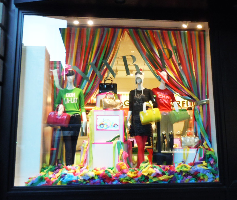
Colorful Holiday at Kate Spade
Labels:
backdrop,
color blocking,
colorful,
holiday,
Kate Spade,
paper,
Year of Color
Monday, August 29, 2011
Colorful drama in Black and White @ Kate Spade
We are loving Kate Spade's year of color for it's cohesive message carried from product through store display and beyond.
July marked their black and white month and the stores really shown in high drama. From the sculpted wigs to the high gloss black props, the stores were a cool welcome in the hot summer.
Black & white is on trend for fall and Kate Spade certainly got it right with their entire window and in-store presentation!
Labels:
black and white,
color blocking,
colorful,
Kate Spade,
small props,
trendspotting
Friday, June 10, 2011
Its all about the paper!
Free People hung paper vine garlands for a jungle like effect which adding a nice pop of color to their 5th Ave location.
Kate Spade, which we covered last week was filled with colorful paper lanterns in pinks, oranges and yellows along side the Indonesian inspired umbrellas.
Gap Kids filled their windows with paper fans and flowers in different shades of blue which was simple yet impactful.
And at Lucky Brand the trend continued with white lanterns against their 'Summer of Love' denim theme.
All of these windows with their paper props signal summer. Keep an eye out for where it will show up next.
Labels:
colorful,
Free People,
Gap,
garland,
Kate Spade,
Lucky Brand,
paper,
paper flowers,
paper lanterns,
trendspotting
Tuesday, January 18, 2011
Holiday recap at Kate Spade
WOW! What a busy season it was. Forgive the long delay on posting.
Thought we would take a minute to look back on some of the holiday displays for inspiration and thoughts for 2011.
it's never too early to start thinking Christmas - especially if you have big plans!
Kate Spade was all about bling and abundance - loved the over sized ornaments and stacked gifting tables with gold trays to keep items organized. and how can you not love those penguins?
for more photos - see Racked's write up
http://ny.racked.com/archives/2010/12/24/kate_and_andy_and_their_always_charming_holiday_vignettes.php
Labels:
CDW Merchants,
festive,
glitter,
holiday,
Kate Spade,
window display
Thursday, October 28, 2010
Party at Kate Spade
Apparently they're in the mood for a party at Kate Spade as the recent window install has a festive, carnival, pre holiday, Halloween vibe
and all that glitters and shines is being used to promote their new jeans line.
and all that glitters and shines is being used to promote their new jeans line.I'm not 100% sure of the connection but it looks fun and spirited and if they want to kick off the season with a dash of whimsy - who are we to say no?
So pass the dip and let's get this party started!
Labels:
festive,
glitter,
holiday,
Kate Spade,
small props,
whimsical
Tuesday, March 30, 2010
we LOVE visual merchandising
and visual merchandisers - and all the many people it takes to give brands their look at a retail level. Like many things, its easy to take something for granted "from the outside". When a shopper walks into a pleasing retail environment, he or she may not understand all the many steps it took to make that magic happen.
Well we do and we salute the creative directors, the production teams, the brand ambassadors, the VM field teams, the store teams and the many, various departments, peoples and teams it takes to make retail shopping fun and retail stores beautiful.
and for those who are out of work or looking for work in the field - try this website
LONG LIVE Visual Merchandising and exciting retail experiences.
Labels:
creativity,
job search,
Kate Spade,
retail,
retail experience,
visual merchandising,
visuals
Thursday, January 14, 2010
All Taped up in Tokyo


LOVE this installation in the Kate Spade store in Japan done by American artist Rebecca Ward. Using gaffer's tape, she has created a color blocked grid of lines and intersecting shapes that add a wonderful back drop for this fun and whimsical product line.For more information on her work - http://www.rebeccasward.com/
Labels:
art in window,
installation,
Kate Spade,
Rebecca Ward,
tape
Wednesday, December 30, 2009
Last Holiday Hurray!!
More glitter and sparkle at A/X - sometimes appearing silver, sometimes like a rainbow, strips of plexi added a bit of drama.
Love these mini sweater ornaments! (though a bit unclear of the message or tie in to store)
Oversize light bulb strands - seen here at Kate Spade but noted in many windows (see Banana Republic blog entry earlier in month)
More natural elements but this time done in gold as seen in this tall wrapped stick trees. Note the outside window boxes that add another layer to window.
A bit of whimsy - seen here at Paul Smith in these festive window vitrines but noted all over - did you get to Barney's or Bergdorf's? Love the white scroll window cling border.
Labels:
A/X,
Banana Republic,
Barney's,
Bergdorf Goodman,
christmas,
eye catching window,
glitter,
holiday,
Kate Spade,
Lighting
Monday, September 28, 2009
Razzle Dazzle!

we couldn't have said it better!
We like to say, "it's all in the details" and in this case, the details speak volumes.
When you want to highlight something small and potentially messy, like tights or hosiery, present it in something to keep it organized and catch consumer's attention, like these trays.
And nothing let's people take notice like a little bling. So think about all the "little" things when you want BIG results.
Labels:
accessory display,
details,
extra mile,
Kate Spade
Monday, August 31, 2009
What's black and white and gold all over....?
Fall at Kate Spade!
The gold paillette wall seen here helps ground this bold, graphic collection. A good example overall how a store re-design can really help promote and aid in merchandising and therefore sales. The store environment helps tell customers the story of the product - in this case a mod and retro group - Groovy!
Labels:
black and white,
Kate Spade,
paillettes,
store environment
Thursday, May 21, 2009
Tuesday, May 19, 2009
Change is good!


Here is a bold redesign at Kate Spade's 5th Avenue store. In an effort to keep things interesting for their customers this store was completely transformed by turning the entrance way into a colorful boutique within the store. Beginning with stripes painted on the sidewalk and leading up to the door, they carried this idea through the windows, onto the floor and up the walls of this new "parlor" entrance. It really carries the eye into the store and makes one want to venture forward. Once there the colors unfold and tell a story of summer and the adventures that await you. And if you need a rest, the new seating area is intimate while offering a birds eye view of the comings and goings on this busy Manhattan corner.
Where have you seen signs of stores "keeping it fresh"?
Labels:
hoola hoops,
Kate Spade,
props,
re-use,
Summer
Subscribe to:
Posts (Atom)