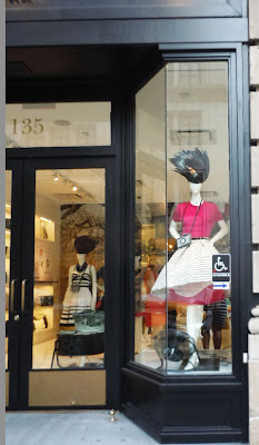


CDW Merchants looks at what retailers are doing to create excitement in stores - a look at visual merchandising and store environment.


 This is baby Katherine, our newest CDW fan, all the way from Guatemala! She looks so cute here in her CDW Merchants branded onsie and we sure appreciate her support.
 We couldn't help but be inspired by the Bleecker Street RRL & Co window. The whole RRL & Co concept is based on pieces that are vintage or vintage inspired, a rugged departure from the preppy chic of traditional Ralph Lauren. Several vintage props such as motorcycles, clocks, hat boxes and ladders set the tone of the windows and drew one into the store.
 JCrew is putting a fashion spin on the periodic table. Their window campaign features mannequins placed in front of a periodic table where a few elements are swapped for featured items of the season. What a clever spin on the periodic table! While we can't quite remember chemistry class and the accuracy of the table, the interpretation is a creative idea and just in time for the all too familiar Back to School season. Who knew shopping and science could work together so well?


 Most of us think of curtains in the traditional sense with drapes of fabric used to give shade to our windows. In visual merchandising the use of a "curtain" can be widely interpreted and help lend excitement to a store window.
  We are huge fans of Birchbox. For those that don't know, this is a monthly subscription service that sends beauty samples to it's members for them to test.
 Similar to Ann Taylor earlier this week, we spotted color blocking at Club Monaco.
 We've seen it on the runway and all over fashion magazines, so it was only a matter of time till color blocking manifested itself to a window campaign.
I recently attended a Stella & Dot Trunk Show and went to support my friend who was the hostess. I ended up buying a necklace and got a pleasant surprise when it arrived as the packing was terrific.
At first glance, my inconspicuous purchase seemed like most postal packages but upon opening it was a fully branded detailed presentation inside.
Here's a company that thinks through all aspects of its model and branding including the inside of the box, the air pillow, the inside box and sleeve and the notes card and enclosed thank you. It made it fun to receive -Great job Stella & Dot! All the elements made me one impressed customer. (PS - I loved what I bought too!)


