CDW Merchants looks at what retailers are doing to create excitement in stores - a look at visual merchandising and store environment.
Showing posts with label colorful. Show all posts
Wednesday, November 30, 2011
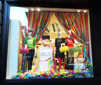
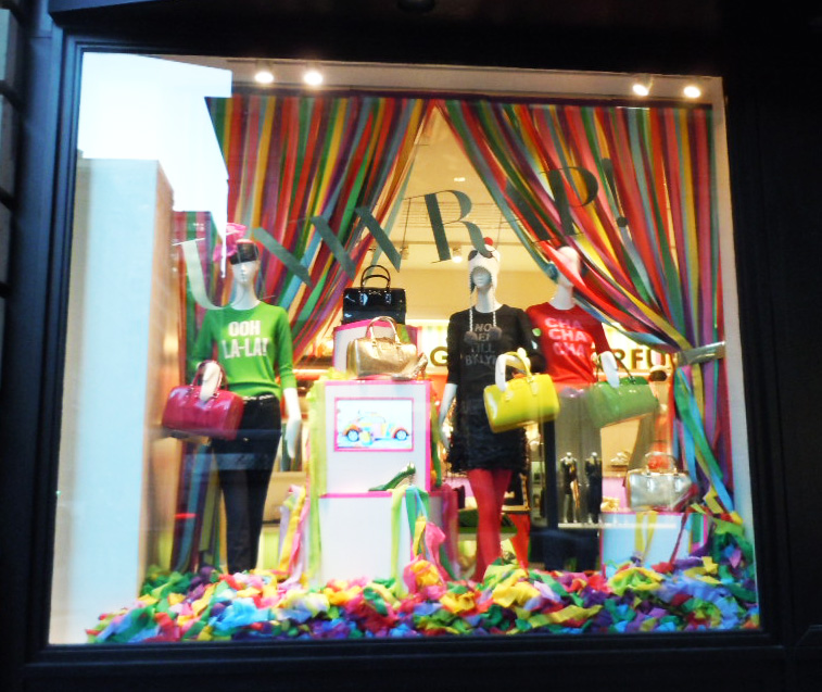
Colorful Holiday at Kate Spade
Labels:
backdrop,
color blocking,
colorful,
holiday,
Kate Spade,
paper,
Year of Color
Wednesday, October 26, 2011
A Wonderful Summer at Anthropologie
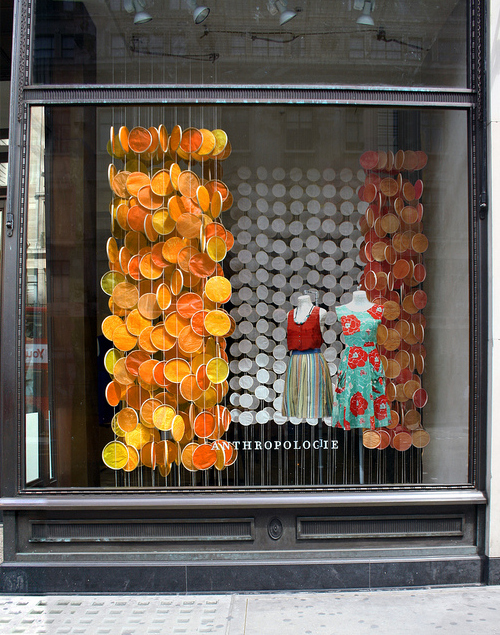
It's a dark day here in NYC - so we are looking back to a brighter time a couple months ago.. at Anthropologie - a brief look back to creative uses of used objects.Anthropolgie's windows vary from store to store, yet always follow a consistent theme and shared elements.
Here's a few interpretations showing wine corks for Earth Day, and hanging paper petals for summer. We love the creativity and craftsmanship and look forward to seeing the holiday windows - sure to dazzle us soon.


Monday, October 24, 2011
Dial M for Madewell
Recently Madewell included them in their windows, perhaps as a nod to the Alexa Chung collection (the Bristish TV personality, editor and stylist).
Last month, they were used at Bloomingdales with the Rachel Zoe window.
Using a large iconic prop in an otherwise simple window presentation works well and adds a burst of color and dimension. And where else can super heros change into their costumes?
Labels:
Alexa Chung,
bloomingdale's,
colorful,
Madewell,
props,
Rachel Zoe,
re-purpose,
simple ideas
Monday, August 29, 2011
Colorful drama in Black and White @ Kate Spade
We are loving Kate Spade's year of color for it's cohesive message carried from product through store display and beyond.
July marked their black and white month and the stores really shown in high drama. From the sculpted wigs to the high gloss black props, the stores were a cool welcome in the hot summer.
Black & white is on trend for fall and Kate Spade certainly got it right with their entire window and in-store presentation!
Labels:
black and white,
color blocking,
colorful,
Kate Spade,
small props,
trendspotting
Friday, August 12, 2011
Total Brand Messaging @ BirchBox
We are huge fans of Birchbox. For those that don't know, this is a monthly subscription service that sends beauty samples to it's members for them to test.Aside from the smart idea of allowing people to test new products, that they may later buy, the branding and marketing of this company makes it really fun.
Beginning with the monthly pink box that arrives at your door - the packaging is well chosen and changes often depending on their partnerships or special promotions. Attention is paid in the all details; from the box, to the tissue & ribbon and even the marketing inserts describing the enclosed products and samples.
Each month it's fun to wait and see what surprises await! Now that's good branding.
Labels:
Birch Box,
brand awareness,
colorful,
marketing message,
packaging,
skincare brand
Wednesday, August 10, 2011
More Color Blocking with Club Monaco
The theme is understated but has a subtle impact, especially in person. For the back walls of their store windows they layered sheets of art paper in a range of neutrals with a pop of brown. It was a pleasing backdrop for their early fall looks shown on their stylish mannequins.
Let's see where this trend will show up next.
Labels:
casual elegance,
Club Monaco,
color blocking,
colorful,
paper,
trendspotting
Tuesday, August 9, 2011
Color blocking at Ann Taylor
Ann Taylor got the trend right by injecting neutrals with brights and staying minimal. This campaign was translated from their website and incorporated solid color banners, mannequin bases and risers blocked with bright colored clings.
They were able to take a trend right idea and present a simple minimalistic presentation that made a bold statement.
Now I'm ready to start color blocking, how about you?
Labels:
Ann Taylor,
backdrop,
colorful,
consistent message,
simple ideas,
trendspotting
Subscribe to:
Posts (Atom)