Monday, March 30, 2009

Window environment


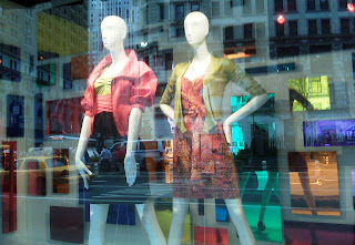
Here are 3 very different windows each with the same general idea - creating an environment or character's room within the window that helps convey the brand. In each of these, the retailer is trying to reach their customers with the use of story telling through props. The upper left is J. Crew's "artist studio", the lower left is Diesel's homage to the 80s via the 60's and the right is Bloomingdale's pop tale for Rebecca Taylor. All have a unique point of view and it's fun to see these visual stories as you walk along.

Friday, March 27, 2009

Spring in the City

Urban, edgy and Chic. We saw this skyline cityscape window and thought the layered collage of elements is quite effective. There is printing on the risers, cut outs of product, logos and accessories combined to create a contemporary window - graphic, big and bold.


Thursday, March 26, 2009

Sneak Peek


Have wanted to post for 3 days but had some technical difficulties. Here's a quick snap shot of where we have been - BETTER photos coming soon. We just returned from Global Shop in Las Vegas and used a butterfly theme in our booth display as a way to convey 'renew, re-use, re-purpose'. We also kept our colors to black and white as anyone who has attended a trade show knows it can be visually overwhelming. The black and white theme was a soothing respite from all the visual "noise". We want to show our clients ways they can extend the life of their props and stretch their visual merchandising budgets further with a few smart solutions. Will be back with more photos and details later.


Friday, March 20, 2009

Glitter Glamour


Unfortunately my photographic work does not capture the simple drama of these windows but boy do they shimmer! In silver, white and black these elegant backdrops cause one to give pause and reflect on the clothing. Ah!


Thursday, March 19, 2009

Be Square!


The black and white square "lattice work" used here is an 'out of the box' twist on an iconic prop. Using lattice work (usually seen in green or white) as a backdrop to convey spring or summer is a classic window dressing. Refigured here into squares with one slat taken out and painted black turns the whole idea upside down, much like this tumbling display. It's graphic and bold and somehow manages to convey rain.
The red and white window is seen at Barney's but they are all highlighting Burberry's spring line. It's hip to be square!

Tuesday, March 17, 2009

Creative SALES!!

Everywhere you look today there's SALES for everything!! Beunos Aires was no exception. Approaches run the gamut. Some VERY serious, some whisical and some just plain having a little fun with it all!

The Invisible Woman


Recently in Buenos Aires we saw this very creative use of depth perception used in a window. Yet again, another great window execution for little money and a little good old fashioned merchandising tricks!


Now you see her, now you don't!

We love Stephen Sprouse!


And so does Louis Vuitton as seen here in a tribute window to "re"launch the Stephen Sprouse collection of 2009(the late designer, Sprouse and LV design director, Marc Jacobs originally collaborated in 2001) The NY windows have these wonderful neon flowers and bold Sprouse style graffiti on the glass, while the San Francisco store gets the message across in a large format graphic window cling. Both are dramatic and eye catching. It's the 80's all over again!

Monday, March 16, 2009

Lights, Cameras, Action!


Saw these windows go up last week and liked the simple rock and roll theme conveyed through lighting, a black and white grid background and a microphone. The tag is "break into spring" with an underlying message of break into song, or break into the music business. Whatever it is, I like the black and white theme. Sometimes, in a sea of color (as we have seen recently) there is clarity in simplicity. Rock on!

Friday, March 13, 2009

Capturing Color


So it seems color is aplenty, must be more signs of spring. Here is a visual story, communicated in color blocks, the 6 suggested steps to a spring wardrobe for those who amble by (which are many as this is bloomingdale's after all). The background unfolds like an accordion as the tale develops. Visually the window reads like a brochure or catalog and the progression caught my eye. Would you 'turn the page' or go inside and shop?
PS - I cannot get this in numeric order (blog deficient!) so forgive me. Thanks.

Thursday, March 12, 2009

For the love of menswear


Growing up, as the daughters of a haberdasher, who was the son of one, menswear is in our blood. Exposed to the business at a young age, we helped our father by folding sweaters on Sundays as he wrote up his orders. From there, my fascination with the business grew and I especially loved the notions and trims that filled the tailor shop.

So this window caught my eye yesterday at Barney's. Highlighting the 'Made to Measure' offerings with the various threads and supplies needed to complete the garments, I love the layered look of this window. Which reminded me of another window seen back in February, juxtaposing the classic trench with office files and a filing cabinet. The window on the left has the back story reference of how the clothes are made, while on the right, it shows where the clothes are worn.

Is it a coincidence that "office" files are the same color as the classic "business" trench coat? I'm not sure, but I do know, it's true what they say about the clothing business..."when the lint gets in your blood, it's hard to get it out".

Wednesday, March 11, 2009

March Mirror Madness


March can be a GREY month so it sure was nice to see these colorful windows. Created with panels of colored fabric and various shapes of colored mirrors; they liven up a bleak landscape and make one look forward to the colors of spring. Plus the reflective nature of the mirrors capture pedestrians' reflections which adds an eye catching element that makes you take note.


Monday, March 9, 2009

Good Props = Good Math


I know, we have said it before, but it's true - props help you tell a story! Get the message of your merchandise or brand across better by adding props to your windows. They enhance the windows and give pedestrians reason to pause. If a pedestrian stops in front of your windows, they are one step closer to walking into your store. The more shoppers in your store, the better chance for sales and ....you see where this is going.
Good windows + pedestrian interest - leads to more customers = better sales. That's math we can ALL relate to!

Friday, March 6, 2009

Ships AHOY!


So you are walking along and VOILA you're on a boat peering into a handbag store! Now THAT is a captivating window.
The window cling creates the wood of the boat and the port hole, the blue waterline is hanging wood or plexi and the rope adds to the theme. Its fun and light and it says "buy resort"! And we love windows that sell!
Land Ho.

Thursday, March 5, 2009

Flitter Fly, I spot another Butterfly!

Ok, we admit now we looking for them, but we don't have to look very hard as butterflies are - everywhere! (and we love it). Here a purple butterfly appears as a window graphic on the first store of designer Anna Sui. Butterflies have long played a roll in her designs and I think this one may be part of her 'logo' or signature branding. It's bright, it's happy, it's graphic - Long Live the Butterfly!
(keep your eyes open too and tell us where you spot them)

Wednesday, March 4, 2009

Framing 34th Street


Not quite as dramatic as their Christmas display but here's a little something from Herald Square. Loads of blue wooden frames in all the windows along 34th Street. Hung, propped and laid on the floor, the bounty of frames was eye catching but one can't help wonder...would a different color have been more dramatic? Does the blue represent something? We love frames and, like butterflies, they are popping up everywhere but want to hear from you...impactful?


Tuesday, March 3, 2009

Butterflies are here again!


We saw this in Soho last week and LOVE the idea of snow and butterflies (butterflies are popping up everywhere). Also - this window has a diorama within the larger window which creates a multi dimensional quality which is really fun in person (sorry about the limits of my photography). The trees, the snow, the woman with the elaborate hat and of course the bounty of hot pink butterflies - what does it all mean? Who cares! It's so great to look at and makes me want to know more about what's inside the store. Ah, the art of windows!


Monday, March 2, 2009

LOVE your brand!


The creativity and enthusiasm present in this window is inspiring. It's a retail outlet for a yarn brand and between the flags, and the lion with the mane of yarn and the yarn balls and scarfs - I want to knit! Even the door handles are wrapped in yarn.
Your store windows can (and we think should) be infectious. But people can't love your brand if you don't get them in the store - so let's capture them at the window. I love windows - hear me roar!